Saturday, March 27, 2010

The Year's Best Magazine Design


The Society of publication Designers announced the finalists for its yearly magazine awards. Check this website: www.fastcompany.com/blog/cliff-kuang
I was really impressed by some of the works.

1)This is by Christopher Nieman for money


2)A stunning work for W magazine by Edward Leida


3)This is by Scott Stowell, creative director for Good.

4) Bon Appetite by Mattew Lenning. This is a single page photography section. I really want to create similar design for my magazine next year. Using amazing images can really work in designing single page section.

5) By Rober Perino


6) This is a brilliant photo illustration by Andrew Nimmo and Beth Bartholomew for Vanity Fair. In this work you can see how typography is important and can create amazing piece of art.


7) This is an amazing work done by Edward Burtynsky!

8) This work is by David Curcurito for Esquire magazine. I really like the use of image and placement of type.


Friday, March 26, 2010

Magazine typography

I read an article by John D. Berry who is an editor and typographer about the magazine typography. In his article he tells us about how magazines communicate through different ways. One of those ways is through the text. Other ways include photography, artwork, cartoons, headlines and even advertising. For my thesis I really want to come up with a unique typography. I wasn't sure if I want to go with something plain, straightforward and readable or something filled with colorful shots, industrial looking sans serif type with a mixture of graphic elements. Berry explains that the dramatic use of a typeface that has a distinctive character can pull a reader into a story. String contrast, sweeping curves and lively details in the type can really work in fashion magazines. Using type in magazines is one of the most challenging forms of typography. I am planning to go to chapters tomorrow and start looking at different layouts of magazines. I think that's a good start.
D.Berry, John. "Magazine Typography". ITC fonts. 26 March,2010

Saturday, March 20, 2010

Logo


I started to look through different fashion magazines across the world. They all have logos which describe their magazine. I could even include this in my research next year. Looking at different logos will help me observe information and design a better one for my magazine.

Thursday, March 18, 2010

ADVERTISING DESIGN AND TYPOGRAPHY


I was looking through a book by Alex White. The name of the book is Advertising and Typography. I think is really important for me to start reading books and get some information about designing my magazine for my thesis. The book has great information about advertising strategies. Fashion magazines are full of ads and is important for me to get familiar with the relationship between images and type. In his book, he mentioned different categories of Graphic design, Advertising design and client's marketing needs.
Graphic Design: Advertising and marketing, Digital and interactive and web, Architectural, product, Editorial and publishing.
Advertising Design: Product Design, Marketing, Illustration, Writing, Typography, Photography.
Client's Needs: Promotion, Public Relations, Product Design, Advertising, Corporate identity.
White also points at where you can find advertising : 1) at home 2) In public spaces 3) At the store/restaurant
The Seven levels of communication by Marty Neumeier
Perception: Contrast, Dimensionality, Color
Sensation: Sensuality, Sexuality
Emotion: Feelings, Desires, Needs
Intellect: Knowledge, Language, Humor, Ego
Identification: Familiarity, Need to belong
Reverberation: History, Tradition, Nature, Truth
Spirituality: Morality, Integrity, Intuition, Beauty
Write also talks about the differences between designers and art directors. Designers are skilled at an art and a craft that includes, typography, working with images and organization but art directors are skilled at conceptualizing, visual organization and managing a team of artists. A survey of advertising creative directors pointed several weaknesses when hiring art directors: 1) Things are not though out 2) The designs are tricky, not simple 3) Concepts are weak 4) Art directors who can't design are comparable to writers who can't write 5) Many young AD are heavy on technical skills but light on thinking. An excellent presentation can't make a bad idea good.

White, Alex. Advertising Design and Typography. New York: Allworth Press, 2006.

Wednesday, March 17, 2010

Magazine readership Sales in Canada

Today, I read an article by Grant Surridge about magazine sales. He mentioned that Hello! magazine is selling 50% more single copies than the same period a year earlier. Hello! magazine is more focusing on British and European celebrity news. Data from the Leading National Advertisers Canada showed that the number of advertising pages in Canadian magazine fell 16% in the fourth quarter copared to 2007. Surridge believed that Hello!'s success is because many Canadians are willing to read about celebrities in order to forget about their economic troubles.

Newsstand sales of magazines in for second half of 2008

In Canada: down 23%

In United States: down 11%

Newsstand sales of Hello! Canada over same period: Up 51%

Newsstand sales of comparable U.S. Publications:

US Weekly: down 21%

OK! Weekly: down 11%

Source: Audit Bureau of Circulations


Surridge, Grant."Say Hello!to Canada's magazine sales hit". Financial Post.Feb10,2009.Financial Post newspaper.March17,2010

Sunday, March 14, 2010

Reading 5

Why designers can't think ( Michael Beirut )
  • Graphic designers are lucky because they can experience many fields for example: they can talk about real state with one client or cancer cures with another.
  • American programs seem to fall into two broad categories: 1) process school and other one is portfolio schools or " Swiss school " , "Slick school"
  • Process schools favor a form- driven problem solving approach. First assignments are simple exercises such as drawing letter forms, Translating three dimensional objects into idealized high contrast images and basic still life photography.
  • In intermediate stages the formal exercises are combined in different ways : combine a letter N with a photograph of a ballet slipper , relate the drawing of a flute to the hand drawn letter N.
  • In final stage, these combination are turned into real graphic design
  • Advanced student gets an assignment to the design a poster for say, an exhibition of Thomas Edison, he or she is temped to revert to form: combine the letter E, drawing of a movie camera, etc.
  • While the unspoken goal of the process school is to duplicate the idealized black and white boot camp regimen of far-off Switzerland, the portfolio school has a completely different, they want to provide student with polished books that will get them jobs after graduation.
  • In portfolio school: problem solving is more conceptual with a bias for appealing, memorable, populist imagery.
  • the portfolio schools are staffed largely by working professionals who teach part time, who are impatient with idle exercises that don't relate to the "Real World"
  • to Portfolio schools, the Swiss method is hermetic and meaningless
  • to the process schools, the Slick method is commercial, shallow and derivative.
  • East Coast corporate identity firms love the process school
  • Package design firms are happy to get portfolio school graduates
  • Both process school and portfolio schools have something in common: what is valued is the way graphic design looks, not what it means
  • semiotics ( Swiss)
  • Conceptual problem solving ( Slick )
I come to bury graphic design ( Kenneth Fitzgerald)
  • Improving life is one of design's ambitions
  • Increasing access to the means of production+desire=an explosive mix
  • Rem Koolhass is a controversial architect who formed his own design studio. he came up with cool architectural theory like the Harvard guide to shopping
  • His engagement to work could be another triumph for the field
  • Mac temp Dave Eggars is another designer who's approach is an anti design style
  • he uses classically readable text, set Garamond
  • Edward Tufte believed that design training isn't necessary for someone to be considered a genius of information design.
  • A successful design program is defined as one that (re)produces more professional design and designers
  • Design has a death wish. It constantly seeks to eradicate itself.
  • Designers are widely seen as possessing an elitist aesthetic agenda insensitive to people's needs.
  • Design education is where little designers come from. reviled progressive and experimental programs
  • Blauvelt believed that design study without application is unlikely. Academia promotes design education the way the field likes it as practical.
  • An education through design rather than in design should be our goal
  • A shift in education away from a professional emphasis may also benefit students
  • Design constructed itself as professional service—formal speech to commune with industry. Business styles itself as rational, tangible, and methodical. But a glance at any day’s business news shows that those are affectations
  • It’s no mystery that the most celebrated, expressive, and inspiring design is either self-motivated or when the designer is truly empowered and entrusted. You must have a personal stake. This is the norm. Its the itinerant artist model that’s an aberration.

Friday, March 12, 2010

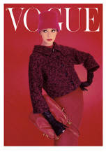
The story of Vogue Magazine


A brief history of the monthly fashion magazine, Vogue by Rebecca Wrenn!

In 1892, Vogue made its debut as a weekly publication. Arthur Baldwin Turnure founded the magazine and ran it until his death in 1909, when Conde Nast took over. Nast changed the magazine to a biweekly publication and also took Vogue globally, first in Britain and than making its way to the always fashionable France. Under Nast, the magazine flourished even during the difficult Great Depression.

In the 1960s, with the help of editor in chief Diana Vreeland, the magazine conformed to the times, promoting contemporary fashion and discussing openly the issues of the era. Vogue launched careers of top models like Twiggy and Penelope Tree and featured trends of the time, such as the mini dress. In 1973, decades after the magazine began, the publication went monthly.

Anna Wintour took over as editor-in-chief in 1988, and is also the current editor-in-chief at Vogue. She is considered responsible for having created an appeal for a wider audience for Vogue. She was the first to put a model wearing jeans on the cover, making denim a chic piece of clothing for women everywhere. Wintour is rumored to be extravagant and harsh, nevertheless she is a powerful force in the fashion world.

Careers by Design by Roz Goldfarb

In careers by Design, Roz Goldfrab talks about editorial design and working in that field.
summary:
  • Editorial design refers to the design of magazines. magazines could appear in print as well as in online media.
  • Publishing is the core for editorial design and it is a field in which the publishers and editors make the primary decisions relating to the focus, concept and marketing of the product.
  • A creative director is usually necessary when a publication is very large or there are several publications within a group.
  • A weekly publication requires more effort than a monthly.
  • The creative director or art director will be responsible for hiring the staff which can also include photo stylists or photo editors.
  • The art director directs the creative team.
  • The designer is involved with working with layouts and perhaps make some of the type and visual decisions.
  • Designers are hired because of their ability to understand the subject matter and visually realize the magazine editor's focus.
  • Different categories of magazines: Lifestyle, Fashion, Business, Trade, High tech, Consumer and spacial interest ( computers, children, education, fitness and .....)


Goldfarb, Roz. Careers by Design: A Business Guide for Graphic Designers. 3rd ed. New York: Allworth Press, 2002.

Editorial Design

I'm really interested in doing editorial design in future. Editorial design is a branch of graphic design which is specialized in the lay out and composition of the different applications such as books, magazines and newspaper. I was looking through different websites to learn more about editorial design. Book design online is a good website explaining brief information about editorial design
http://www.bookdesignonline.com

The most important part of a publication is the outer part and a designer should pay attention to the cover and all small details such as spine, flaps and etc. Many people choose a magazine base on what they see and read on the cover. For my thesis I want to design a magazine and I think I should start gather suitable typefaces that can attract my target audience. I should consider their cultural characteristics, their age and gender.
I should also pay attention to legibility of my typeface and images I intend to use. Image is another key element in editorial design and I have to consider it's function and locations i want to place them. choosing a right paper could also be important in publication design. I will definitely look through different papers with different weights, textures and colors.

Saturday, March 6, 2010

THESIS ( Fashion magazines and body image)

Yesterday, I read an article by Sherry Turner about the influence of fashion magazines on the body image satisfaction. she did her research on if the depictions of women in magazines would affect women's perceptions of their own bodies. Eight magazines were used as stimulus materials. Each magazine was selected on the basis of its popularity and availability. Four magazines that had reputations for exhibiting the thin fashion ideal among women were chosen: Vogue (November, 1991), Bazaar (October, 1991), Elle (November, 1991), and Allure (November, 1991). The four news magazines used in the control condition included Time (November 4, 1991), Newsweek (October 28, 1991), U.S. News & World Report (October 28, 1991), and Business Week (November 4, 1991).

Thirty-minute appointments were scheduled for those women who expressed an interest in this study. Upon arrival, each participant was greeted by a member of the research team and given a consent form explaining that the study was designed to examine body image satisfaction among college women. After giving consent, each participant was informed that there would be a short delay, asked to leave her books and other items in the lobby, and escorted to a small room where she waited alone.

The waiting room contained three chairs and a coffee table on which four magazines were placed. For half of the participants, the waiting room contained only news magazines; for the remaining half, there were only fashion magazines. No other posters or pictures of people or reading materials were available in the waiting room. After 13 minutes, participants were escorted to a large classroom and given the questionnaire to complete. Unlimited time was given for completion.

Ten participants indicated on their questionnaire that they did not read a magazine while waiting. These students were eliminated from the data analyses. The resulting sample consisted of 18 (37%) participants in the fashion magazine condition and 21 (43%) in the news magazine condition. Their major hypothesis was that when compared to their peers who viewed news magazines, women who viewed fashion magazines prior to completing a body image satisfaction questionnaire would: (1) be less satisfied with their bodies; (2) prefer an ideal body type that is smaller, and (3) express greater preoccupation with thinness and dieting. T-tests were used to examine differences between participants in the fashion magazine and news magazine conditions. The results of this investigation demonstrate the role of the media in shaping, rather than merely reflecting, societal perceptions of the female body. Consistent with our hypothesis, it was found that women's body image satisfaction is, indeed, influenced by their exposure to the thin ideal presented in fashion magazines. Although the two groups of women in this study did not differ significantly in height or weight, those who read fashion magazines prior to completing a body image satisfaction survey desired to weigh less and perceived themselves more negatively than did those who read news magazines. Exposure to fashion magazines was related to women's greater preoccupation with being thin, dissatisfaction with their bodies, frustration about weight, and fear about deviating from the thin standard. The influence of the media on the body image satisfaction and self-perception of non-white women also deserves attention. African American, Asian American, Native American, and Latina women are often overlooked in research on this subject. Further, women of color are grossly underrepresented in fashion magazines and other types of media. Thus, the impact of the media's reinforcement of the thin and white ideal on the physical and emotional well-being of women of color should be understood.


Sherry L. Turner "The influence of fashion magazines on the body image satisfaction of college women: an exploratory analysis". Adolescence. FindArticles.com. 07 March, 2010. http://findarticles.com/p/articles

Tuesday, March 2, 2010

VOGUE Fashion History


Interview with an expert

Lat week I called Garry Short, a manager of planning, design and development section of Parks. I wanted to ask him few questions regarding our group project. This is my interview:

1) Are all parks accessible for everyone even those with physical disabilities?

At this time not all parks are accessible, however, new facilities and amenities are to be designed and constructed to incorporate the council approved City of Toronto Accessibility Design Guidelines

2) What kinds of methods are people using to navigate through parks? (signs, maps, etc..)

In new facilities, there are ranges of methods to navigate through parks. For many people in Toronto, the City provides an abundance of opportunities and experiences free of limitations imposed upon them by the built environment. For Torontonians with disabilities, however, the built environment imposes numerous obstacles that limit their ability to moving about freely and safely without concern. In June 2000, Toronto City Council adopted a motion to make the City fully accessible by the year 2008. They also came with policies such as:
Public Pedestrian routes should be designed to ensure the comfort and safety of all persons regardless of age or ability.

• All active routes required to accommodate persons using mobility aids, walkers, or persons accompanied by guide dogs, should be a minimum of 1500 mm wide; 1675 mm is preferred.

• All routes should be free of protruding obstacles, overhanging signs, branches
etc., in the walking area, to aid persons with visual limitations.

• The maximum allowable protrusion of objects into any pedestrian route from grade to a recommended height of 2030 mm is 100 mm.

• All accessible parking spaces should be marked with the "International Symbol of Accessibility", (e.g., with a paving sign and a post mounted sign).

• A comprehensive exterior signage and way-finding system is required at every major site or facility, to assist visitors with varying disabilities to locate appropriate parking accessible entrances.

• the street address and/or building/facility name should be clearly visible from the street or public laneway.

• Lettering size should be legible at typical viewing distances (e.g., from the road, approach route, parking area, etc.).

• Signage generally should be in bold ‘sans-serif’ lettering (e.g., Helvetica) on a highly contrasting background.

• Building addresses or identifying signage at street level, whether it is mounted in landscaped areas or on posts, should be high enough to be clearly visible even with snow piled nearby.

• Pedestrian, vehicular, and emergency routes should all be clearly identified.

• One-way routes should be clearly marked – both with paving markings and by post-mounted signs.

• The "International Symbol of Accessibility" should be used to identify special amenities, such as accessible parking, accessible entrances, or accessible washrooms.

Garry short also send us The Accessibility Design Guidelines that can be used by all sectors to conduct accessibility audits and to plan developments as we work towards making Toronto a "barrier free" community.

• All directional signage and locational signage should be mounted at eye-level, between 1370 mm and 1525 mm high, for quick and easy identification by persons who have visual limitations.

• Essential print information should generally be printed in large text on a highly contrasting background color.

3) Do all parks follow the same way finding design?

Not yet, however a Parks Standards initiative is in its early stages and is to standardize service amenities.